What does this suggestion change/add/remove:
1. Decreasing of the size of the name boxes in the Command Center section of the Personnel Tablets.
2. Movement or removal of the static "Return to Command Center" button on the top of the "Communication Cutoff" and "Pager Control" tabs.
3. Increase the size of the scroll bars in both sections of the Command Center.
4. Move the "Enter Pager Message" box in the "Pager Control" tab.
5. Fix the cursor desynch please.
Has something similar been suggested before? If so, why is your suggestion different?:
Other than the desynch being possibly suggested before, all of these are new as the new tablets came out today. As such, these couldn't have been suggested before.
Possible Positives of the suggestion:
1. Personnel Tablets are easier to use.
2. It's harder to misclick on things and get yelled at for it.
Possible Negatives of the suggestion:
1. Dev time.
2. All but one of these are something the general populace won't get to use anyway. (Command Center)
Based on the Positives & Negatives, why should this suggestion be accepted:
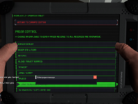
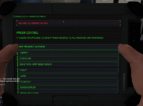
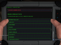
Simply for quality-of-life changes. Right now, as the below images will help show, the Command Center is rather tricky to use right. The scroll bar is hidden behind your thumb until you scroll down a little. You can't send a pager message without closing out the tablet as trying to do so otherwise clicks on the person's name below it and doesn't let you type. The "Return to Command Center" button does not work unless you are all the way at the top of the list of names which sort of elements the point of it following you on your scroll. Also, doing that turns of whoever's comms are in the spot under the button Lastly, the cursor desynch is just a little annoying as you have 2 cursors on screen that are not connected and only 1 actually does anything so it's easy to misclick things due to that. (My screenshot form hides my normal mouse, so you'll have to trust me when I say that there is a desynch.)


 Senior Game Master
 Donator