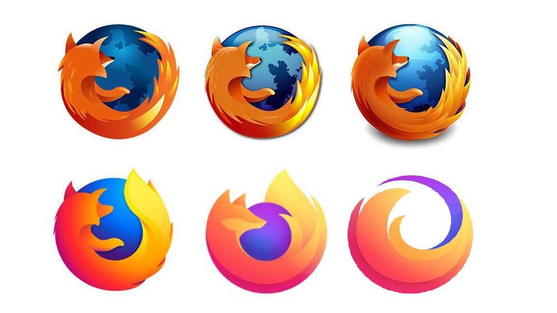
What does this suggestion change/add/remove:
[Change back to the previous logo with the bird]
Possible Positives of the suggestion (At least 2):
[it's a classic and recognisable logo that is good and draws peoples attention in.]
Possible Negatives of the suggestion:
[The people who made the new logo might be sad (sorry but its bad)]
Based on the Positives & Negatives, why should this suggestion be accepted:
[Because its a logo many aren't familiar with and might struggle to find CG severs due to the logo chage and the new logo is not appealing]
Upvote
2
 Donator