What does this suggestion change/add/remove:
[Clipboard features added:
1. Fonts (Helvetica, Computer Modern, Times New Roman, etc...)
2. Emphasis (Bold-Face),(Italics),(Underline), etc),
3. Lists (Like this one)
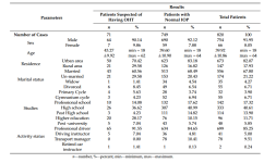
4. Tables (Example below, toggle to be boxed on all sides as well?)
 (Note: Doesn't have to match the exact formatting, an addition of a simple table insert function is fine)
5. Indentation ~ Alignment Wrapping (There is no indentation function for using tab, adding a center, left and right align would be useful)
6. Wrap around fix for clipboard (Currently if you try to space on a new line with text, It will jump to a new line, ties in with 5th suggestion)
7. Font Size (Currently you can only change font size by inserts, and those are fixed sizes)
8. Font Colours ~ Highlighting (Possibly helps with reviewing significant points of data)
9. Image Rotation + Custom Placement (You can only edit the size and the horizontal shift of the picture. Add a veritcal shift and make it so the image doesn't shift the text.) {This falls under suggestion 6. and 5. respectively}]
Has something similar been suggested before? If so, why is your suggestion different?:
[N/A]
Possible Positives of the suggestion (At least 2):
[1. Neater Formatting for documents as well as more features for Researchers and Medical staff alike.
2. Removes the wrap around bug
3. Brings more creativity to the document write up
4. For suggestion 8, it may be helpful if one wants to review a document and distinguish their writing from the original authors, this includes highlighting as well. (This may tie into a different suggestion with editing printed documents // highlighting permission for it. (This would be a toggle feature for it, but it isn't the main point for this suggestion thread) ]
Possible Negatives of the suggestion:
[Rewriting of document outlining and guidelines with the restrictions of usage in the grading criteria of research documents. (Not certain if this is applicable for this suggestion but, most certainly will be brought up if this suggestion is passed.)
Limitations with how many fonts would be added // non-standardized fonts. ( I would do a poll on this to figure out which ones to add if plausible)
Image outline // example draft of what it would look like integrated with the existing system.]
Based on the Positives & Negatives, why should this suggestion be accepted:
[Overall these suggestions provide a brevity for creative expression in document write-ups, in as much that there can be more of a nuance with how documents can be formatted and presented. For the 5~6th suggestion, People currently in Medical and Research wings respectively are currently aware of this bug and restricts our document layout ~ format for writing well formed documents.]
I hope these suggestions are possible to implement in due time, any further discussion regarding it in the comments is heavily appreciated.
If the content team needs a more descriptive and exact image of what these features would look like, please let me know. (It's mostly just Word // Google Docs features)
Thank, you for reading my suggestion and have a great day!
[Clipboard features added:
1. Fonts (Helvetica, Computer Modern, Times New Roman, etc...)
2. Emphasis (Bold-Face),(Italics),(Underline), etc),
3. Lists (Like this one)
4. Tables (Example below, toggle to be boxed on all sides as well?)
 (Note: Doesn't have to match the exact formatting, an addition of a simple table insert function is fine)
5. Indentation ~ Alignment Wrapping (There is no indentation function for using tab, adding a center, left and right align would be useful)
6. Wrap around fix for clipboard (Currently if you try to space on a new line with text, It will jump to a new line, ties in with 5th suggestion)
7. Font Size (Currently you can only change font size by inserts, and those are fixed sizes)
8. Font Colours ~ Highlighting (Possibly helps with reviewing significant points of data)
9. Image Rotation + Custom Placement (You can only edit the size and the horizontal shift of the picture. Add a veritcal shift and make it so the image doesn't shift the text.) {This falls under suggestion 6. and 5. respectively}]
Has something similar been suggested before? If so, why is your suggestion different?:
[N/A]
Possible Positives of the suggestion (At least 2):
[1. Neater Formatting for documents as well as more features for Researchers and Medical staff alike.
2. Removes the wrap around bug
3. Brings more creativity to the document write up
4. For suggestion 8, it may be helpful if one wants to review a document and distinguish their writing from the original authors, this includes highlighting as well. (This may tie into a different suggestion with editing printed documents // highlighting permission for it. (This would be a toggle feature for it, but it isn't the main point for this suggestion thread) ]
Possible Negatives of the suggestion:
[Rewriting of document outlining and guidelines with the restrictions of usage in the grading criteria of research documents. (Not certain if this is applicable for this suggestion but, most certainly will be brought up if this suggestion is passed.)
Limitations with how many fonts would be added // non-standardized fonts. ( I would do a poll on this to figure out which ones to add if plausible)
Image outline // example draft of what it would look like integrated with the existing system.]
Based on the Positives & Negatives, why should this suggestion be accepted:
[Overall these suggestions provide a brevity for creative expression in document write-ups, in as much that there can be more of a nuance with how documents can be formatted and presented. For the 5~6th suggestion, People currently in Medical and Research wings respectively are currently aware of this bug and restricts our document layout ~ format for writing well formed documents.]
I hope these suggestions are possible to implement in due time, any further discussion regarding it in the comments is heavily appreciated.
If the content team needs a more descriptive and exact image of what these features would look like, please let me know. (It's mostly just Word // Google Docs features)
Thank, you for reading my suggestion and have a great day!
Last edited:

 Programming Team
 Senior Developer
 Senior Game Master
 Donator